

BRAND
bold, clean, minimal design with personality
Tom Hosking
Tom is a wedding photographer based in Edinburgh. He came to me to work on a new brand for his business. He had used his own design for the first few years of his photography career but felt like he needed to step up his branding as his business grew.
Right from the beginning Tom knew he wanted something different from the norm, shying away from soft pastel colours and flowers, aiming for a professional look but full of character.
Inverting the surname might seem a bit odd, but as soon as we both saw it, it clicked with us as a simple way to stand out and indicate a photographer with something more to offer than the usual. The Recoleta font is just beautiful to work with and gives this logo lots of character.
The secondary graphics are all based around classic camera dials and instrumentation, I normally try to avoid camera cliches in my logos for photographers but I think this implementation really fits in with the brand and offers a feeling of professionalism. I wanted the brand to look established and heritage but without looking old and stuffy.
(Job completed in 2018)


Alexa Loy Photography
Alexa is a UK family, portrait and weddingphotographer. She had specialised in wedding for the last decade, but in the last year has expanded her business to involve more family photography and training.
This shift in business called for a new brand look and feel. Our starting point was Alexa’s love of Cornwall, specifically the colours and shapes of St. Ives. This resulted in a palette of vibrant yellows and blues, contrasted with slate grey and deep blues. Alexa also wanted to draw inspiration from the famous tradition of artists from the area, this is why we have a rough, hand-crafted edge to the style. There are nods to print-making, sketching, line drawing, watercolour and oil paints.
(Job completed in 2019)


Maytree Photography
Danni Maytree came to me to refresh her branding. Our idea was to keep the tree motif in some form but to update the look and find some more contemporary fonts choices.
We thought that the original logo was professional looking, with some visual connection to the name, but it lacked personality and an emotional connection.
After a little research and some initial ideas we hit upon this friendly line drawing look. I had the idea of using a clasping hand motif, I feel it expresses romance and weddings, while remaining non-gendered. From here i developed the full logo symbol marrying the hands and the tree in a strong oval shape.
(Job completed in 2018)

Matt Badenoch
Logo mark made for Matt Badenoch photography.
Matt wanted a new logo that would express his excitement about his job and show some of his personality. He likes to be at a wedding from the first champagne cork to the last dancefloor move, so felt this explosion of colour fitted his style.
(Job completed in 2016)


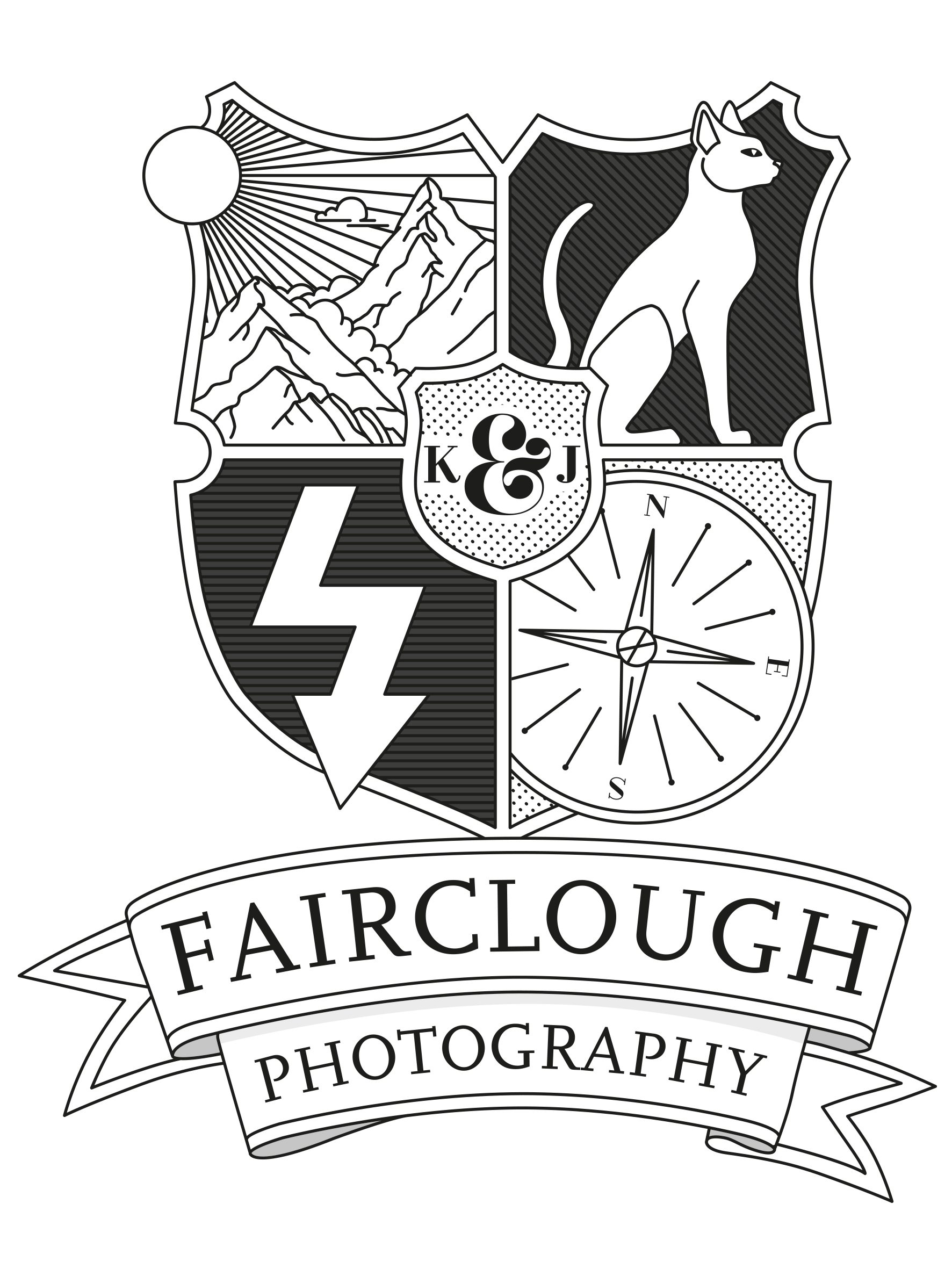
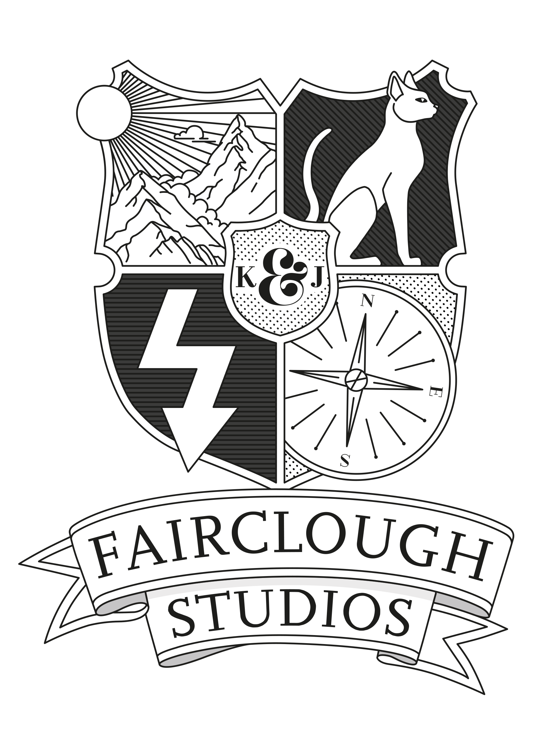
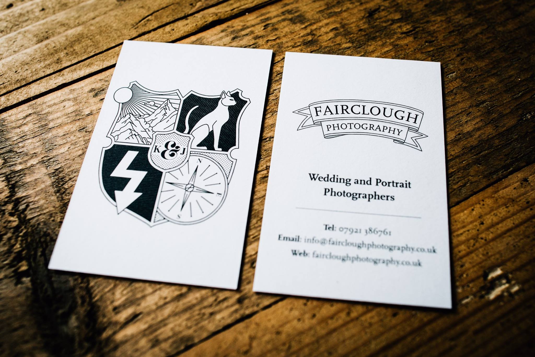
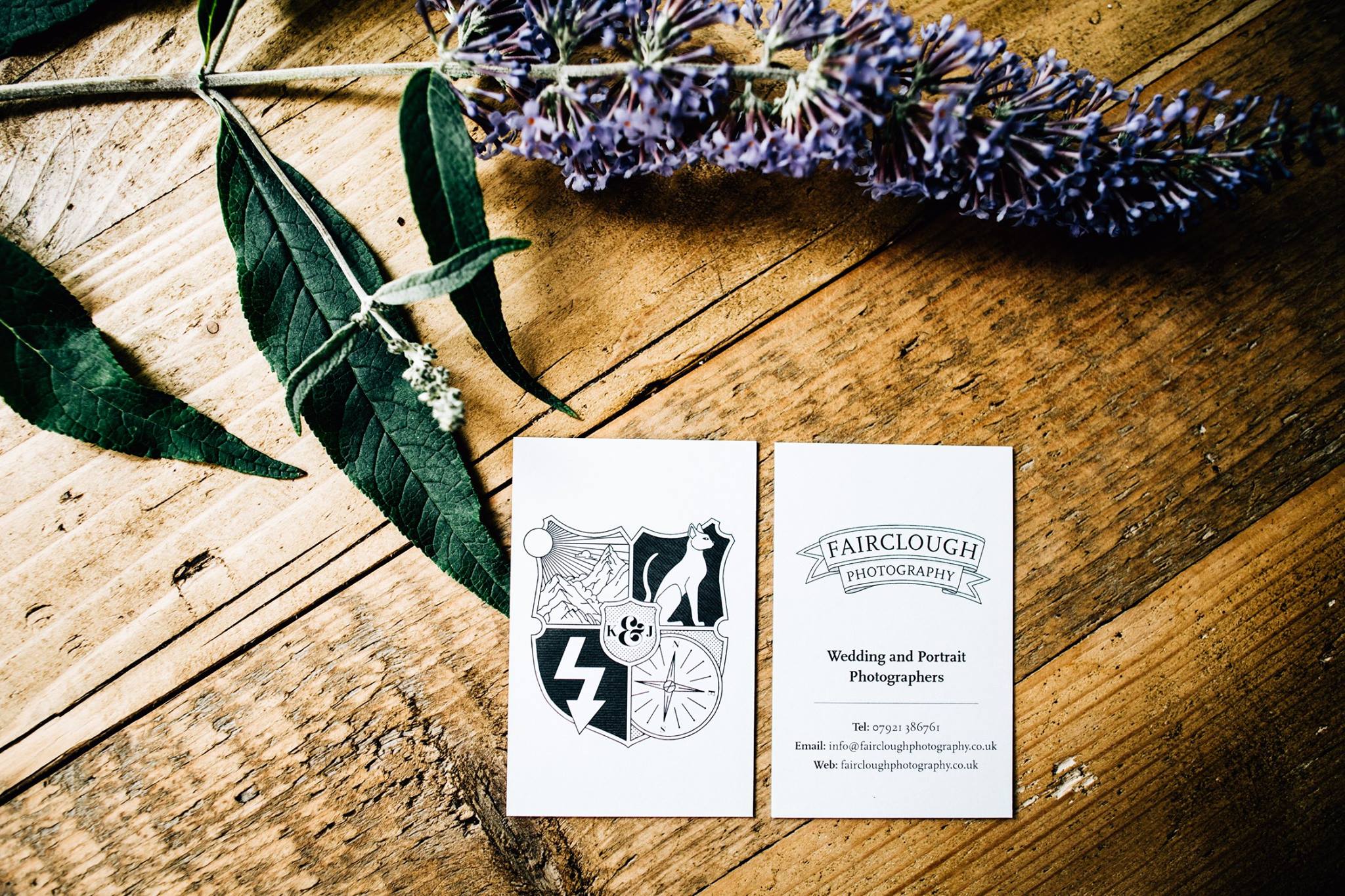
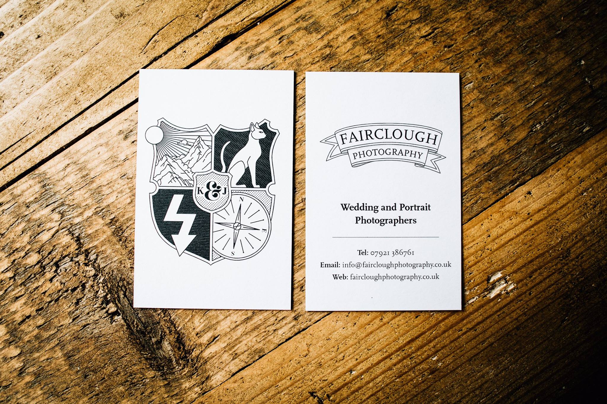
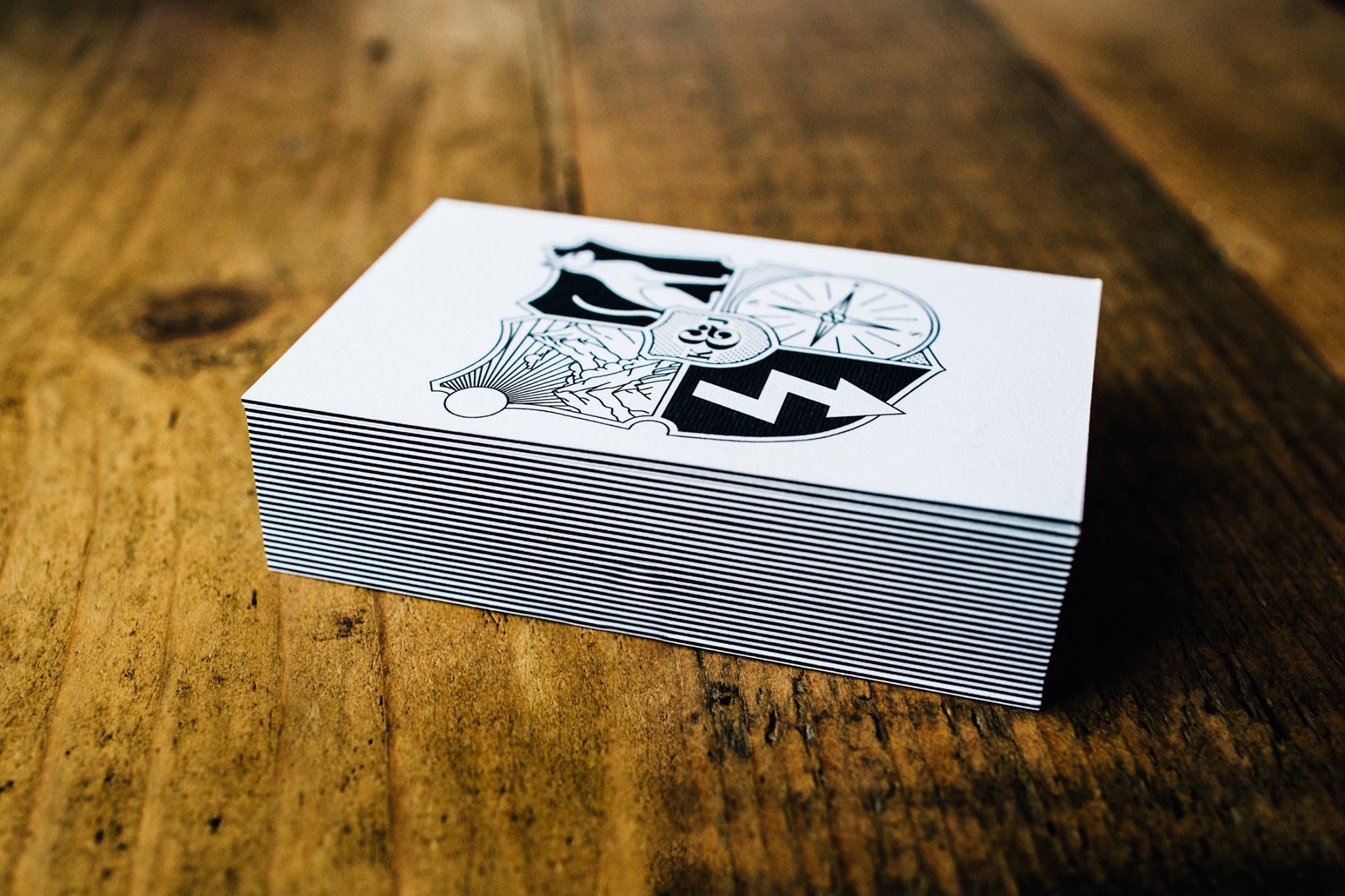
Fairclough Photography
One of my favourite logos ever!
Fairclough Photography are a wife and husband team shooting weddings in the North West UK.
They wanted to put across their personalities from the beginning so we went for this shield design as a vehicle to pack in the symbols.
Overall design: The Faircloughs are proper Harry Potter nerds, so we were confident from early on that the final design would take the form of a shield.
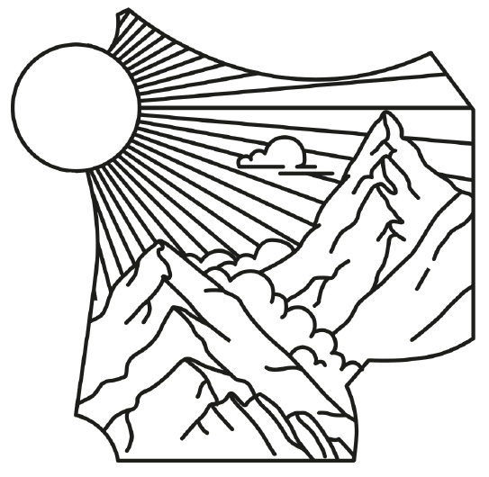
Top left: This is a representation of the meaning of their name, a fair-clough translates to ‘fair hollow’ or ‘beautiful ravine’ so we have this valley illustration with sun breaking out of the shield edge
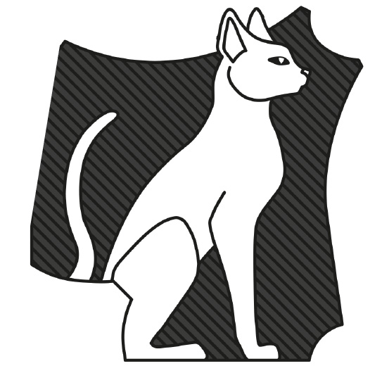
Top right: This one’s not to complicated, they love cats! We had to get a representation of their cats Booby & Baby Wee in there.
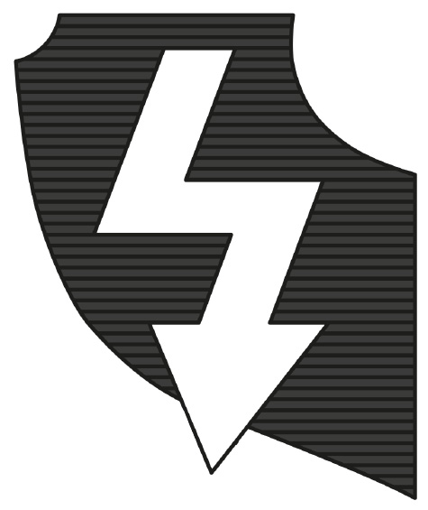
Bottom left: This is a nod to general camera-y-ness. I am normally not one to put cameras or apertures into photographer’s logos, but as we had lots of info being communicated if felt if it was subtle we could sneak in a camera icon. This flash icon fits in with the Harry Potter theme as well as photography.
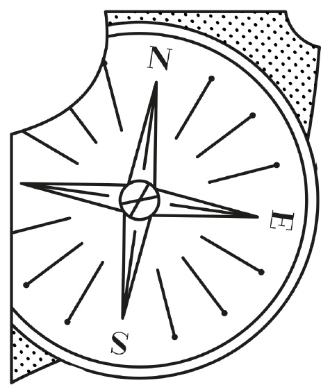
Bottom right: A simple representation of a compass to represent the Fairclough’s love of travel and their readiness to take on destination weddings.
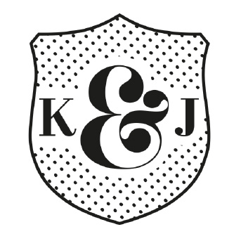
Centre: K&J for Katie and James or course!
(Job completed in 2016, updated 2017 & 2018)

Shelby Chari Photography
Shelby is a wedding and boudoir photographer in New England USA.
She asked me to help her develop a new brand for her photography business. I am always excited when a client wants to trust their new brand to me, but I am always extra flattered that someone from another country gets in touch.
We spent a lot of time at the beginning of the project researching and defining Shelby's ideal clients, then looking at sort of branding that would resonate with them.
Some Client Keywords were: Art lovers, creative, foodies, well traveled, LGBT supporting, Green fingered, outdoor types
Our visual keywords were: modern, nature, plants, outdoors, texture, geometric, monochrome patterns, Blues/greens/crimson and gold accents
Shelby was in love with the jade and gold palette from the beginning so I set about making a strong stand alone shape and textured background that would make this colour scheme pop. The end result is rich and textured with a high-end feeling, but earthy and approachable.


